
Let’s butcher Shakespeare for a moment, shall we?
“What’s in a label? That which we call a wine by any other label would taste as fine.”
And while Shakespeare may be groaning from his grave at the moment, it’s true. The wine inside a bottle tastes the same regardless of what its label looks like.
But, and here we go again (sorry, Will), “The label’s the thing wherein we catch the wine drinker.”
Labels can draw in new consumers, including the younger legal drinkers, the ones the wine world is eager to instill a love of the grape. And because wine drinkers are more often shopping with their eyes, reports Wine Enthusiast, the visuals on a label matter. If the visuals are playful or artful, that “signals approachability.”
Many New York wineries have understood the importance of their label designs for decades, using artwork to both tell the winery’s story and attract wine drinkers to their bottles.
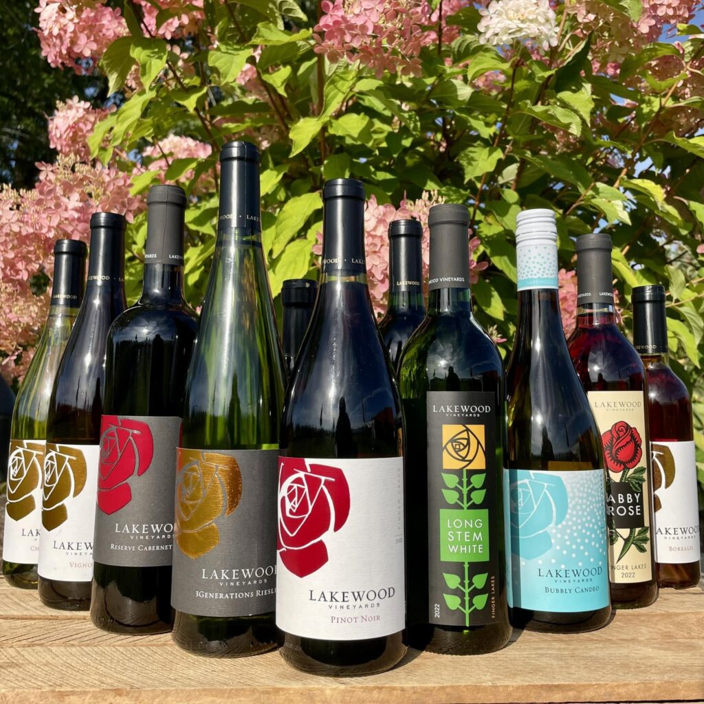
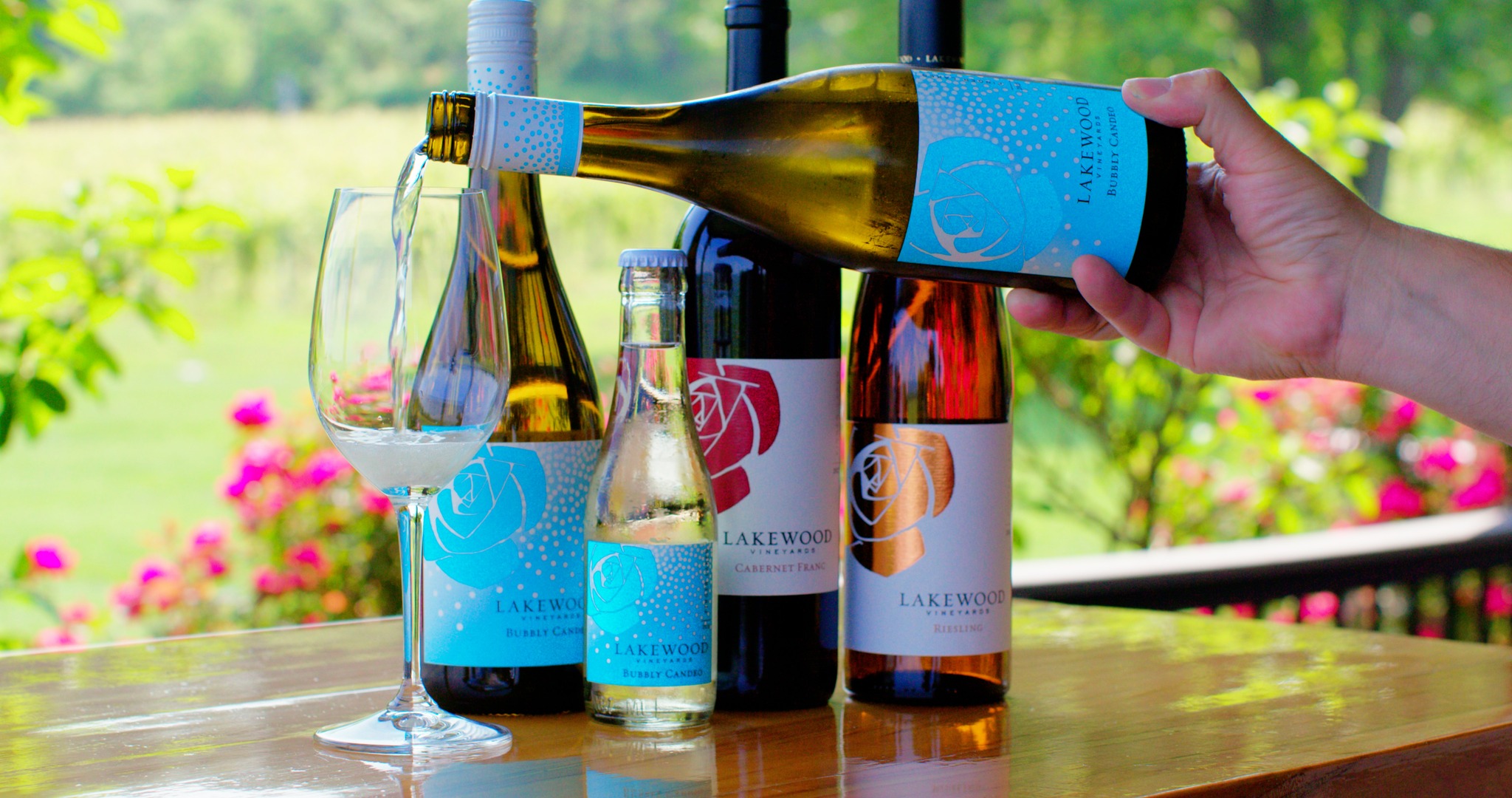
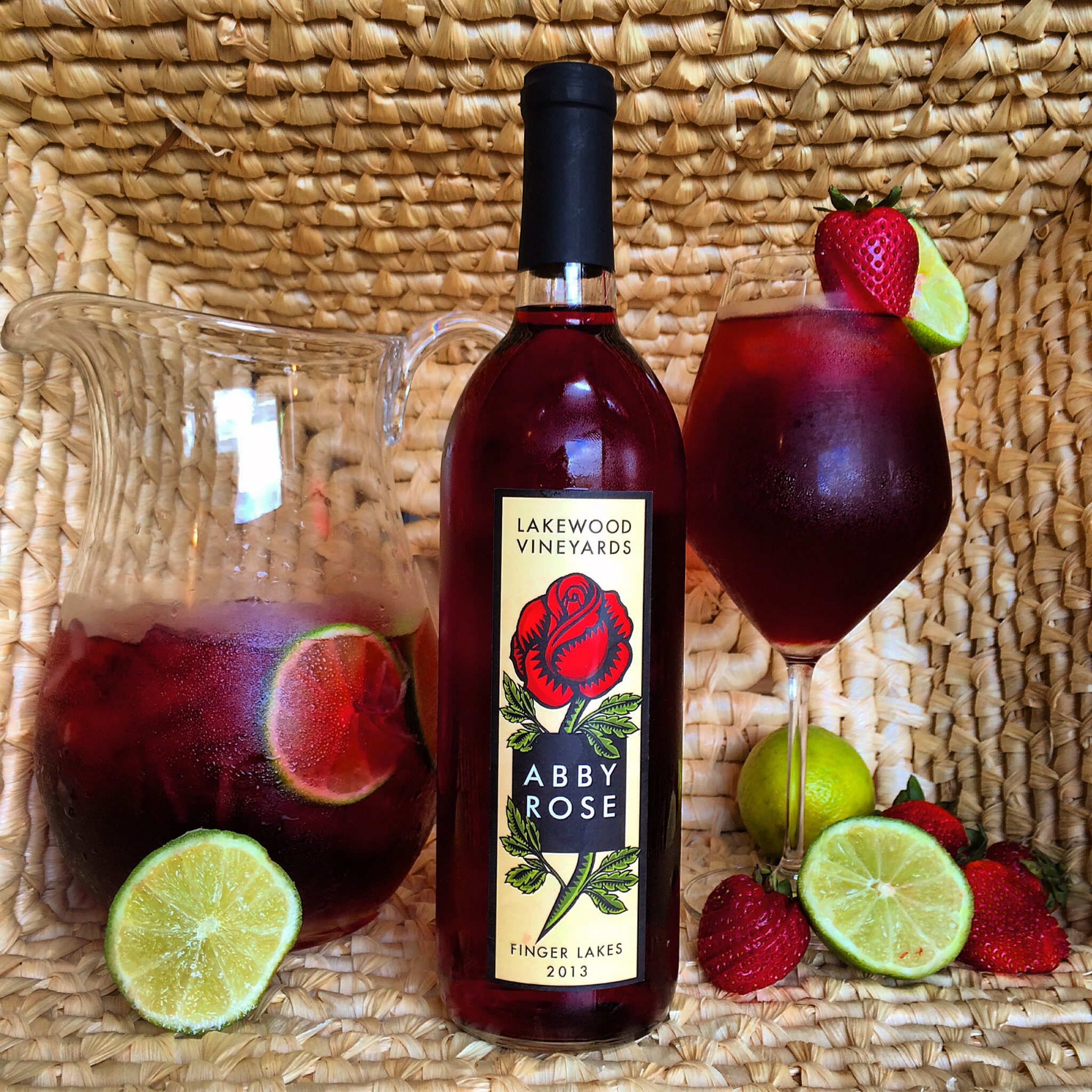
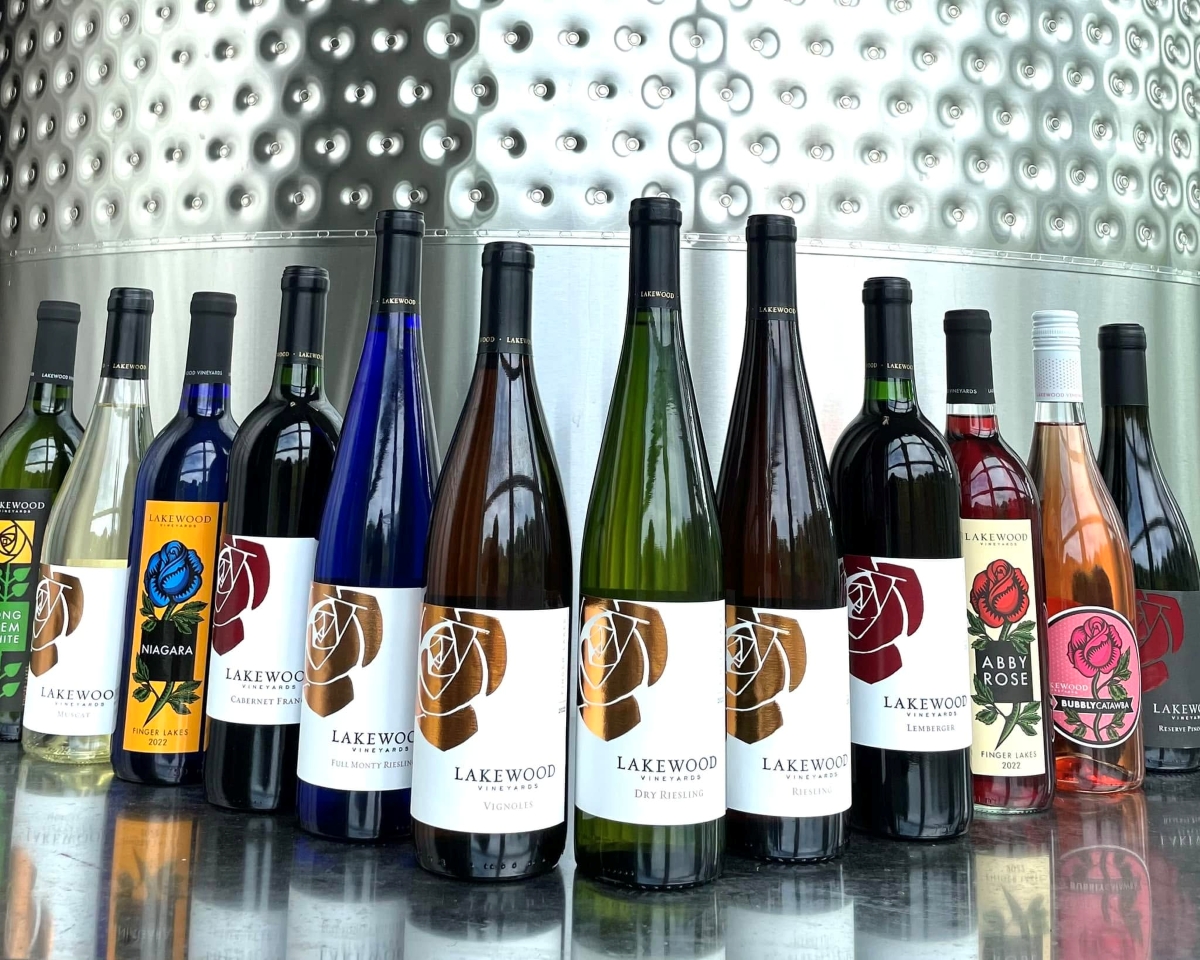
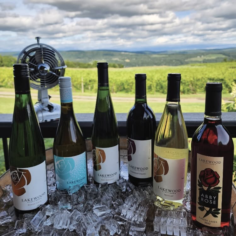
Lakewood Vineyards, Looking to Stand Out on a Shelf
The rose on the Lakewood Vineyards bottles is recognizable to wine drinkers who love what the Watkins Glen winery produces, but that rose went through several iterations to become one that draws people to it.
“My sister-in-law Erin was doing wholesale in the shops, and someone told her, ‘I love the wine, but the label is not something I’d give as a gift,’” says Liz Stamp, family partner in Lakewood. That exchange was one of the things that led Lakewood to hire a company in California to redesign its Vinifera labels while incorporating the rose associated with Lakewood since the 1960s.
The flower has become a recognizable symbol of Lakewood. The winery now has several label designs, all containing a rose, which often differentiate the winery’s bottles produced from hybrids or native varieties, all created with an eye for what will stand out.
“We really were trying to be conscious of making it recognizable on the shelf, not that we’re the biggest player in the wholesale world, but it’s important not to get lost,” says Stamp.
She does not advise making a label change lightly, however, and warns against making dramatic changes without putting a lot of thought into it.
“One of the things that’s always hard to grasp is exactly how long it takes for people to connect with your brand if you make a significant label change,” she says. “It takes a long time to build label recognition. A good design company will make you look at what you want to achieve and what you want to say [with your label].”
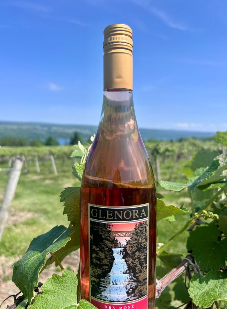
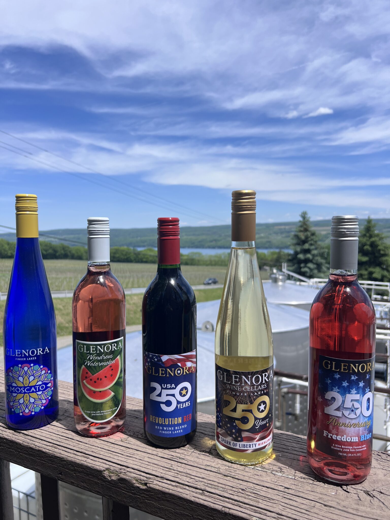
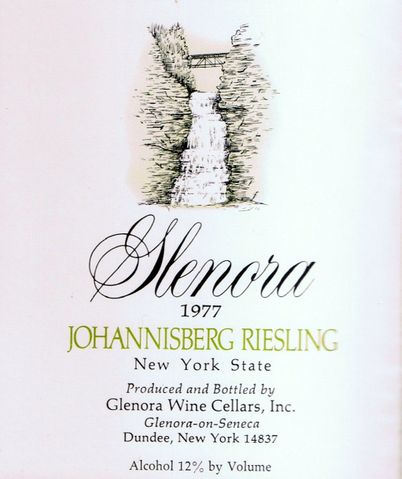
Glenora Wine Cellars, Honoring History
At Glenora Wine Cellars in Dundee, the label that’s predominantly on its single variety wines—and has been since the winery’s early days in the mid-1970s—represents the history of the region.
“When Gene Peirce and his partners were founding the winery, they didn’t have a name or a label. But since he had grown up in this area, and the Glenora Falls were an important local landmark with a long history here, they decided to go with that,” says winemaker Edward Miller.
The winery’s signature waterfall label has remained a constant. It has gone through some updates, including the embossing and the color scheme, and is used for all of Glenora’s smaller lot, premium products, varietal wines, and one red blend.
And while there may be updates from time to time, the core waterfall remains the same because it’s integral to the brand.
Glenora, which sold to new owners last year, also has other labels for some of its blends featuring dogs and taxi-cabs on some of its more easy-going wines, and there may be conversations in the future about changing those, but not yet.
“Any changes,” says Miller, “honor the place where we’re making wine and keep the brand recognizable.”
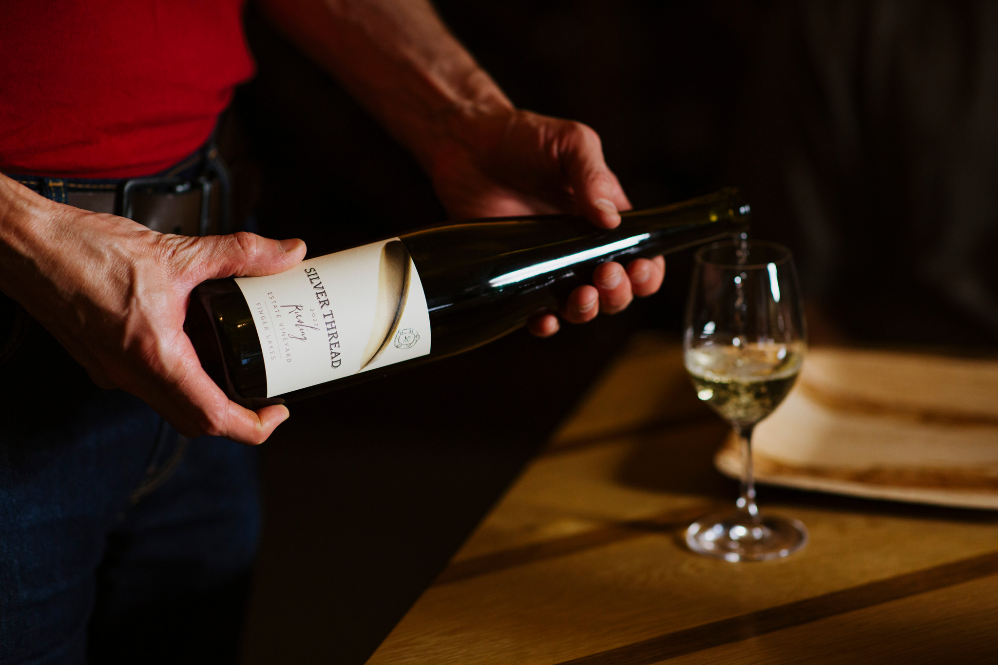
Silver Thread Vineyard, Conveying Values
Look on any bottle of Silver Thread Vineyard’s wine, and somewhere you will find a turtle.
“I cannot claim credit for the turtle,” says Shannon Brock, owner and general manager of the winery in Lodi. “It was Richard Fiegel, the founder of Silver Thread, who learned about it. It’s a petroglyph, a rock carving, found in New York, and the artifact is currently on display at the New York Botanical Gardens.”
The original artifact, carved by a member of the Lenni Lenape tribe, also known as the Delaware Tribe, is related to the creation story shared by all of the Eastern Woodland tribes.
“The earth was born on a turtle’s back,” explains Brock of the tribes’ beliefs. “The turtle is also the earth symbol. Because Silver Thread was founded on the principles of organic and natural farming, that was the connection to the earth symbol.”
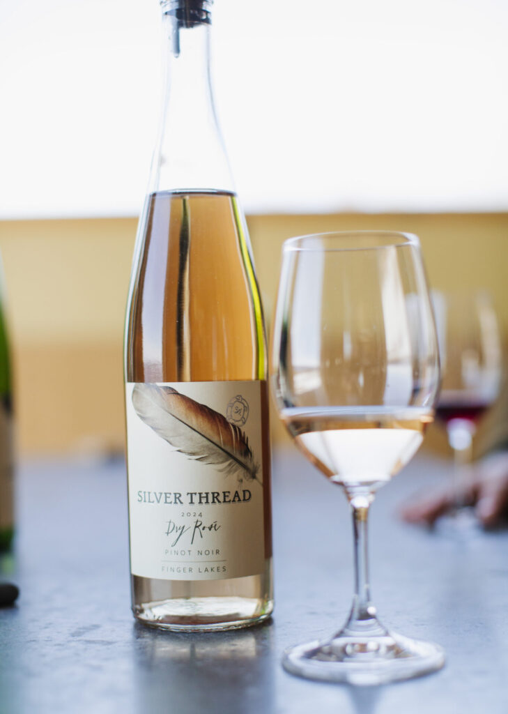
That turtle has been a feature of the winery’s labels since the very first vintage in 1991, reminding the winery to care for the earth and water that give the gift of wine. Its size and location on the label have changed through the years; right now, it’s on the upper right-hand corner, where it began, but it has grown and shrunk back down over the years.
Brock believes the labels convey relevant information to current consumers.
“They convey a sense of naturalness about our wines,” she says. “We wanted something that was going to be attractive but also convey that sense of our values as a producer and match that to the consumer.”
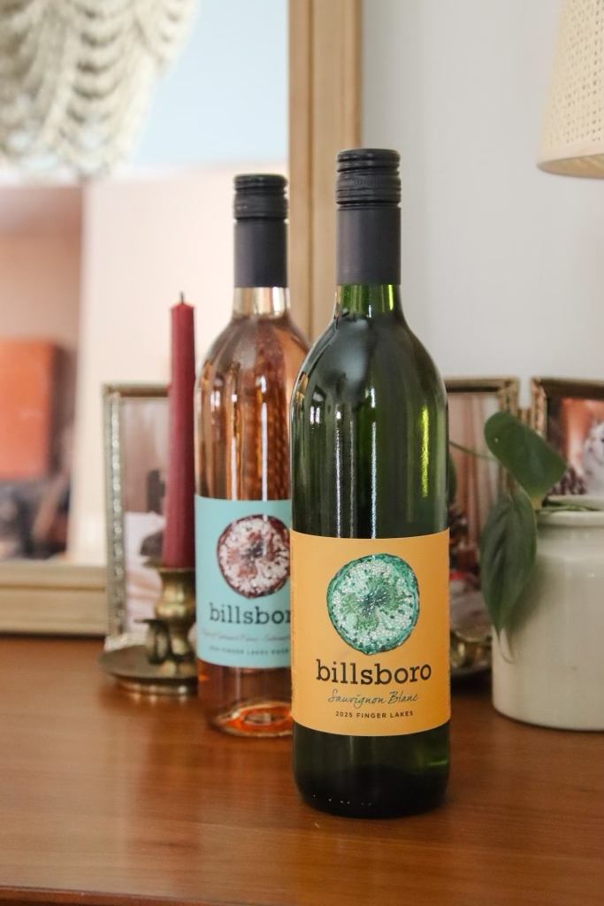
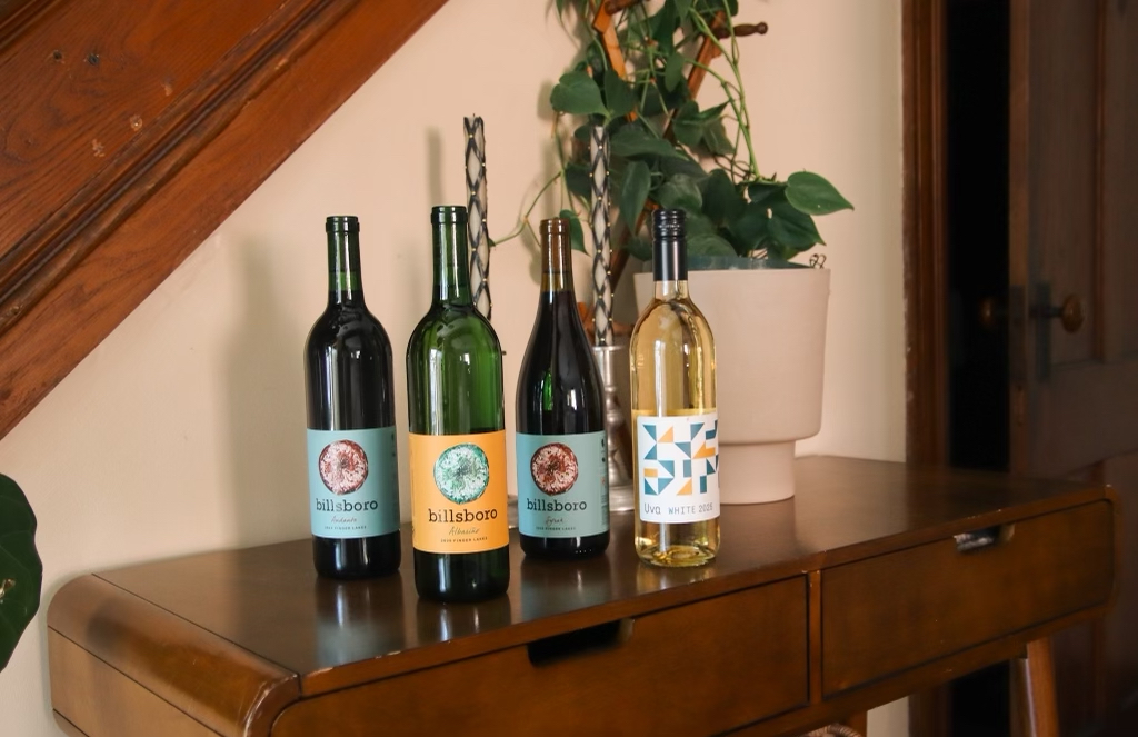
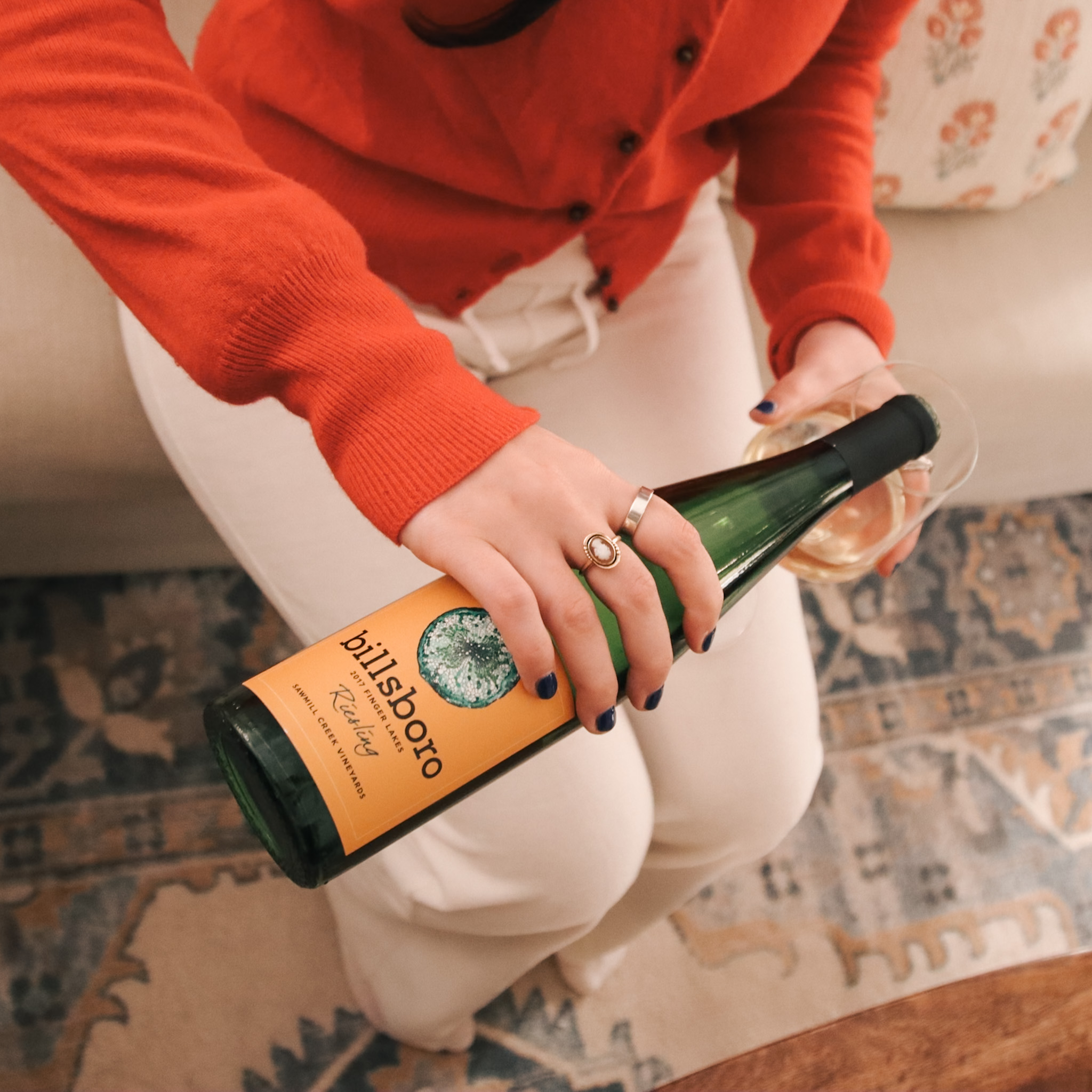
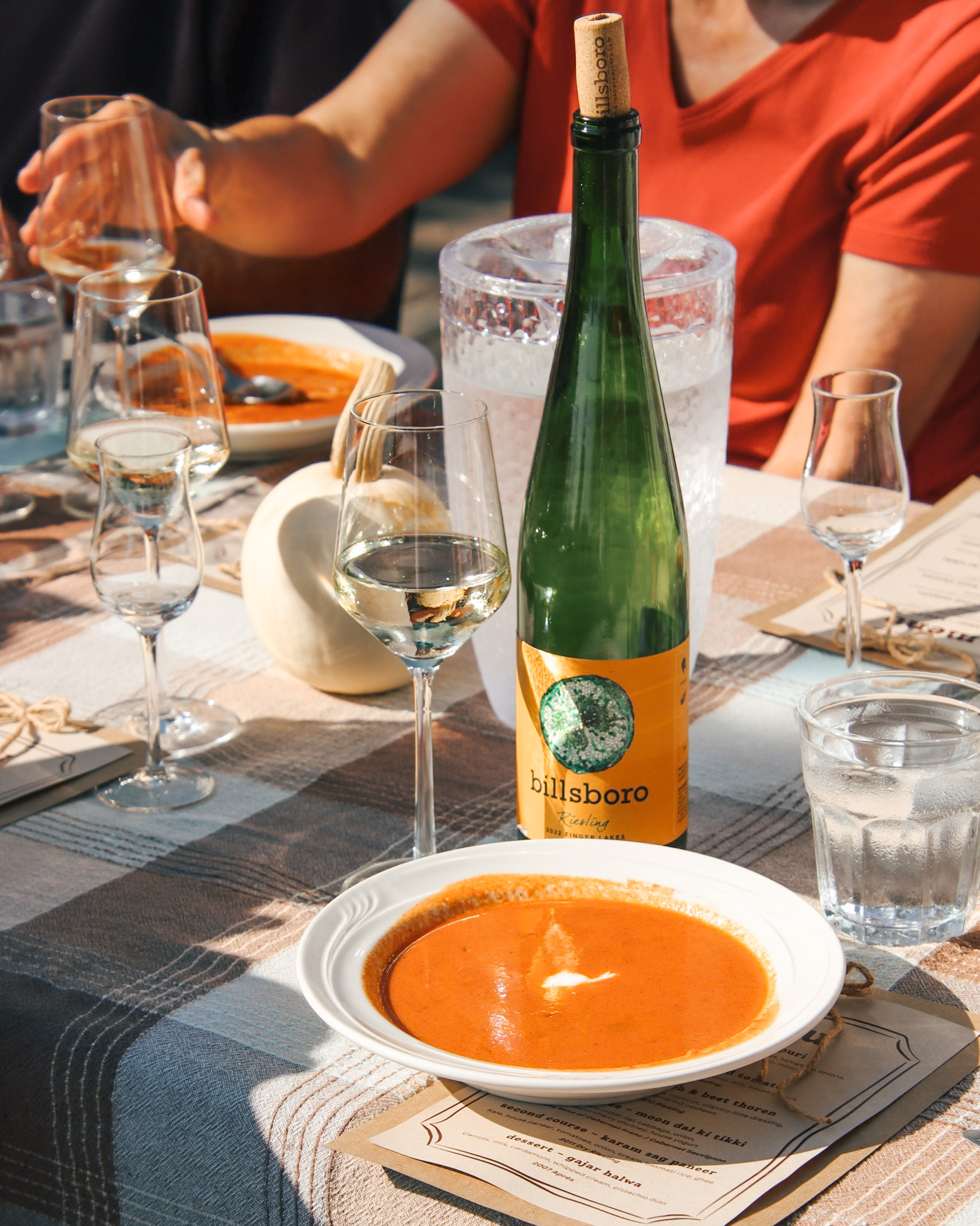
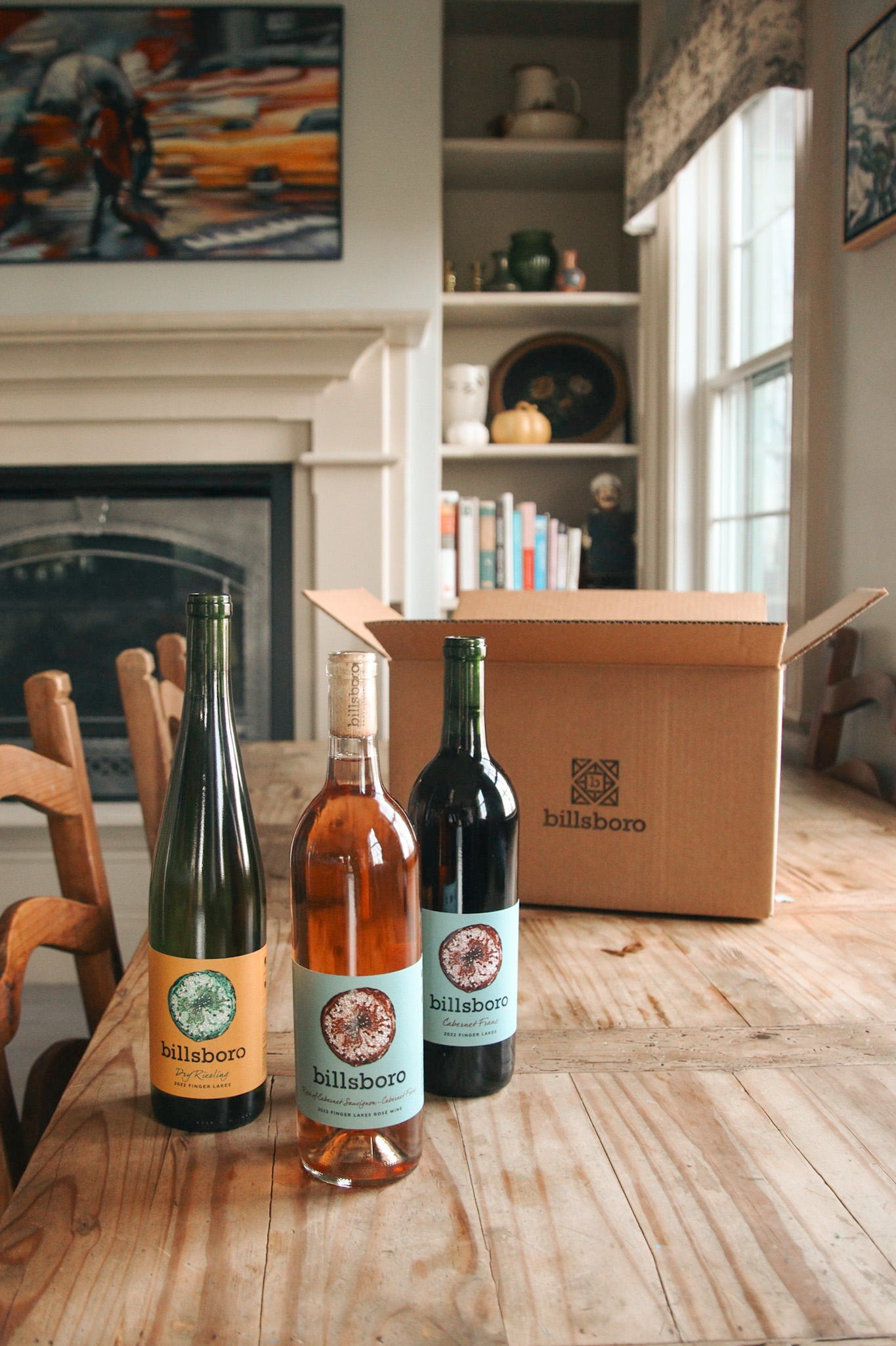
Billsboro Winery, Visuals, Optics, and Graphics That Grab Attention
“I think we’re on to the third iteration of our label, but it has never strayed from the original artwork,” says Vinny Aliperti, co-owner and winemaker at Billsboro Winery in Geneva.
The artwork mentioned is a microscopic slice of a grapevine, which he is fairly certain is from a Cabernet Franc grapevine. Choosing it for the label was kind of a happenstance, he says.
“We were at a friend’s house, and he had a coffee table book that included all these cool images of organic botanical natural things under a powerful microscope,” says Aliperti. “The lightbulb kind of went off.”
It wasn’t long before Aliperti found himself in the office of Cornell University’s since-retired Martin Goffinet, who shared dozens of possible images to use on the labels, including the microscopic grapevine slice. Until just a few years ago, it was the artwork for Billsboro’s only label design.
The winery has since added a second label based on the design of a barn quilt in a pattern called Peace and Plenty. Three of the winery’s more entry-level, affordable wines use a deconstructed version of that quilt on their labels.
“It’s geometric, clean, and kind of contemporary, more modern,” says Aliperti.
Both labels have visual, optics, and graphics that he believes grab attention.
“We all know that the wine is delicious inside the bottle, but what sells the wine is the package,” he says, which brings us back to the butchered Shakespeare.
What’s in a label? A story. History. Values. An attention grabber. And something that says, “there’s wine you want to drink in here.” Sometimes, that involves changing the label to fit what current consumers perceive conveys that while also honoring a winery’s history.
